Chemport Europe
Chemport Europe is a an innovative ecosystem for chemicals and materials in the north of the Netherlands. Their belief is that that chemical industry needs to go green and everyday they work towards this goal.
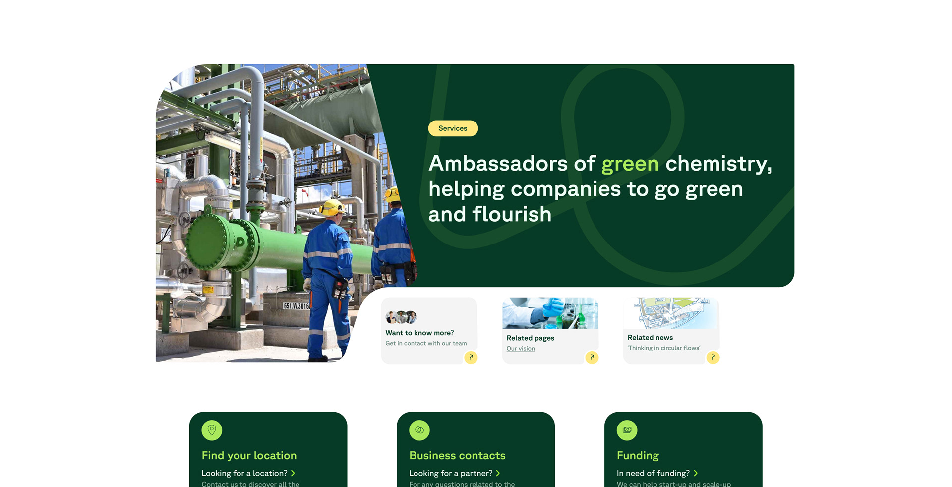
During my Internship at B2 Design agency I was table to tag along my supervisor and create my own branding direction for visual identity and website of the client.
This case shows the designs I created during the project and not the definitive branding and website of Chemport Europe.
Objective
Refresh branding and website of Chemport Europe to reach new target audience and represent new goals and values
Deliverables
Branding direction and Website prototype
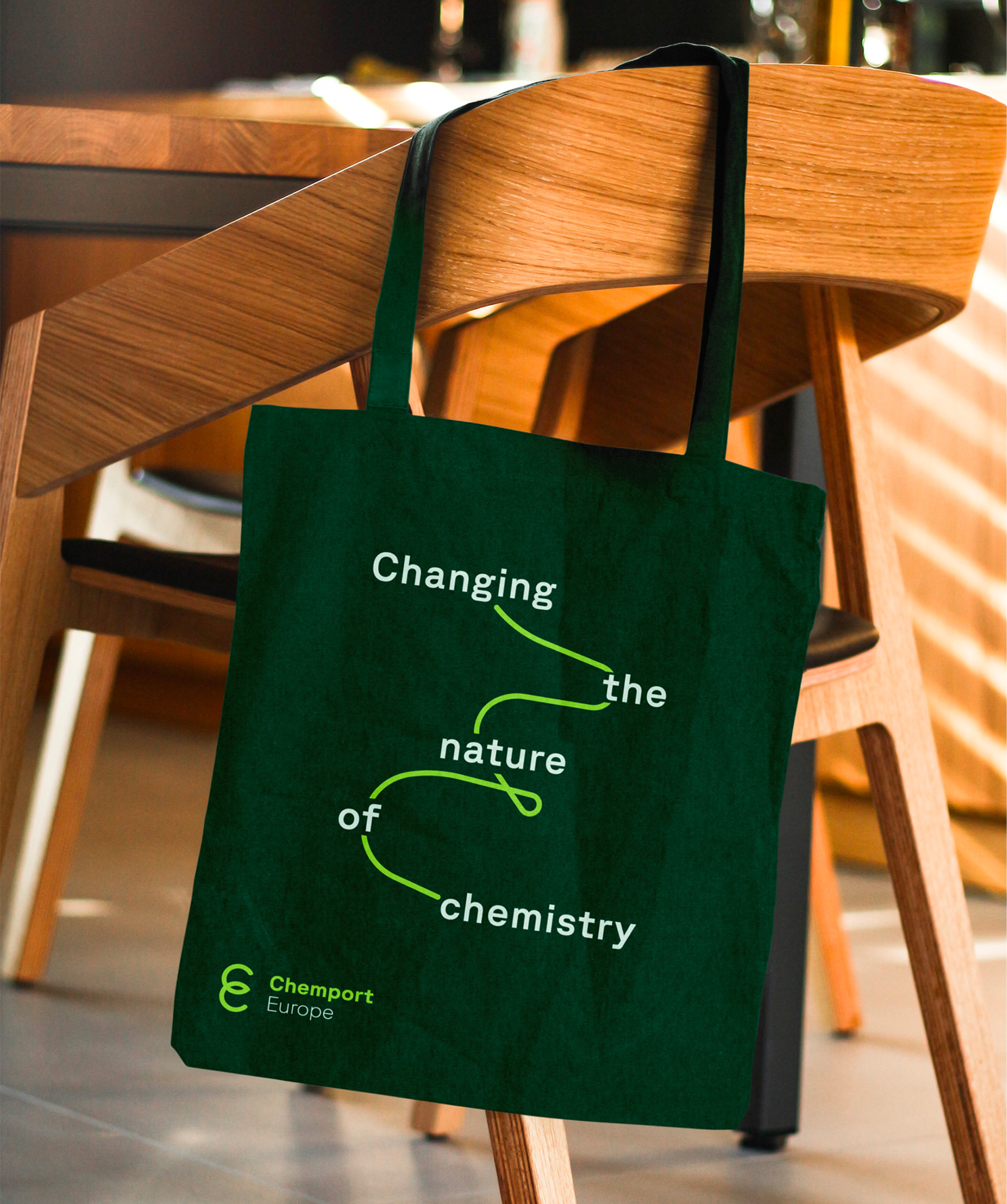
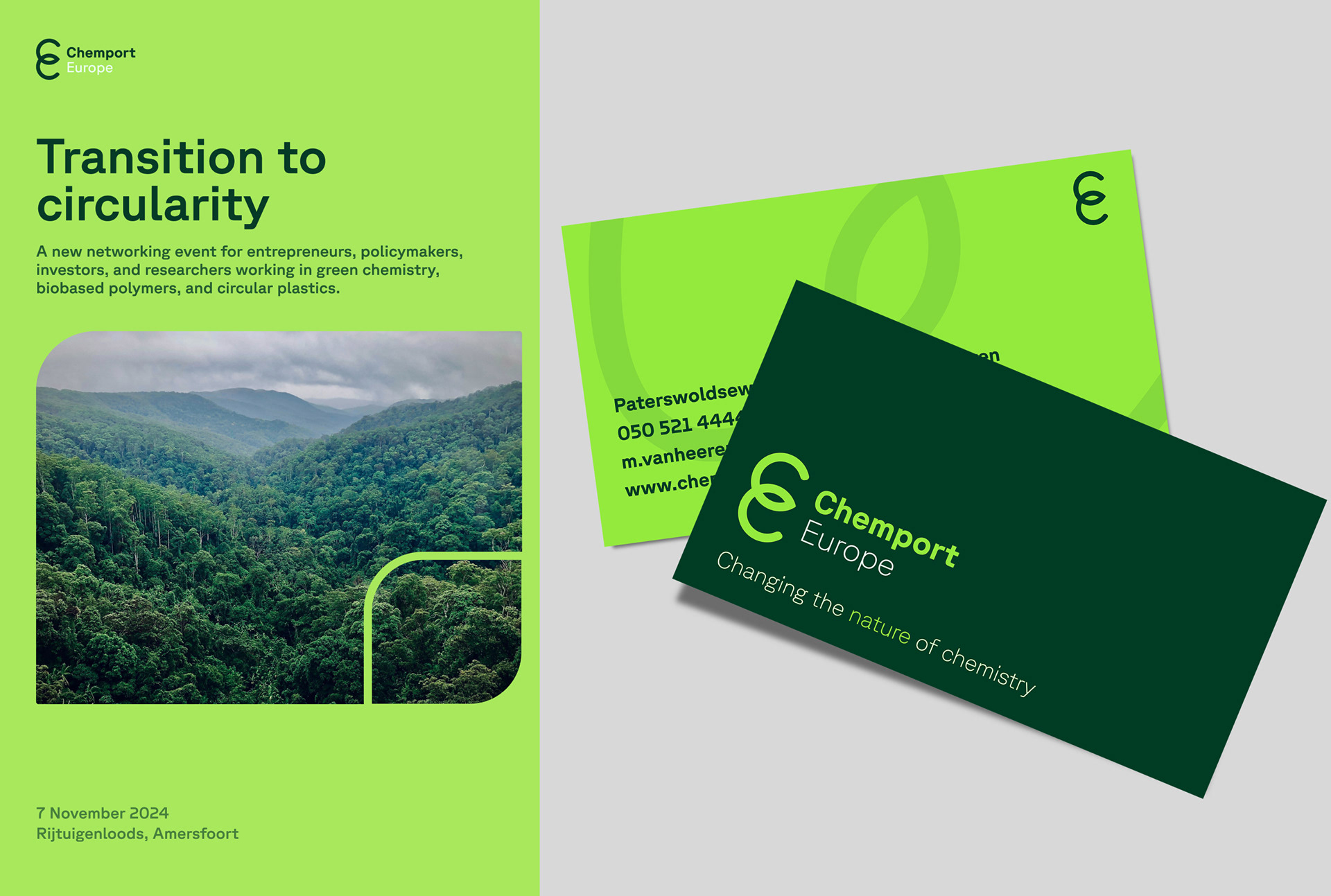
The strategy employed to create a refreshed branding for Chemport Europe focused on a more vibrant, trustworthy and nature inspired aesthetic reflecting the company's commitment into making chemistry green.
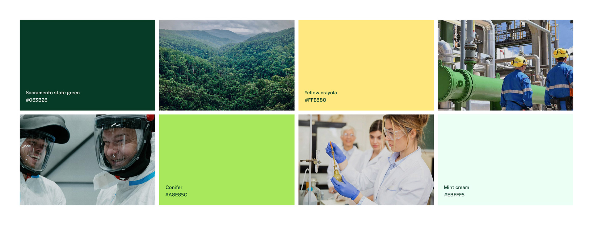
The visual design features a palette of greens with accent colors like yellow and mint, which makes the branding more versatile and modern while maintaining the recognisable green touch that Chemport is known for by their clients.
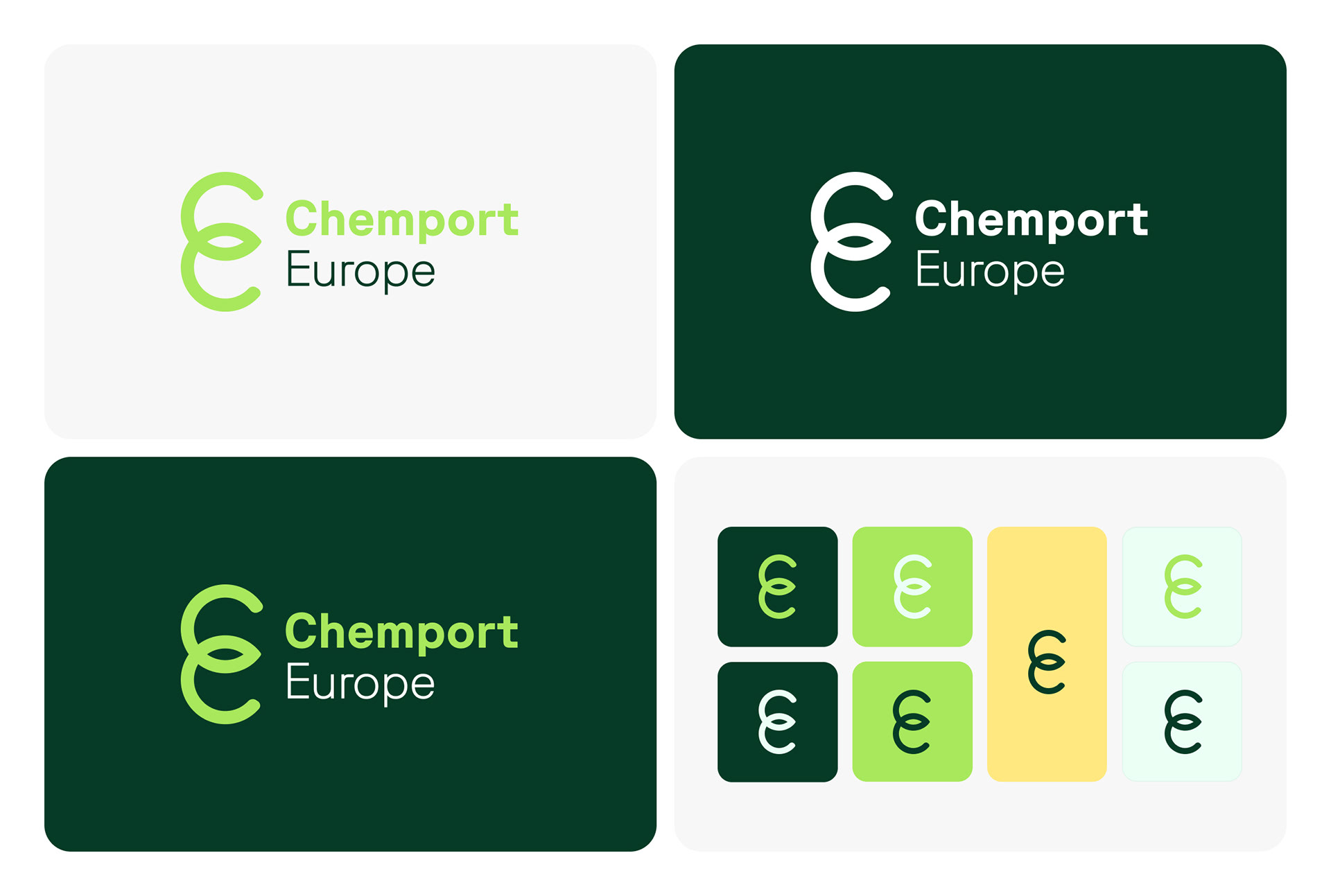
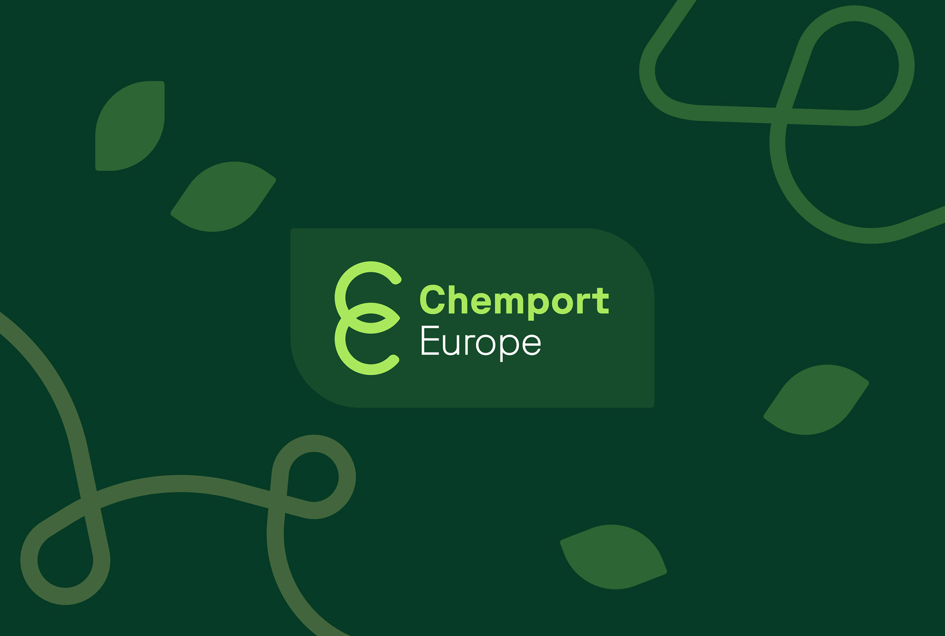
The logo is now more friendly and sleek, the loop that intersects in the shape of a leaf. Two brand assets that I also used across the different mockups and prototypes to highlight the "green" nature of the company and also its wish to create union and collaboration among companies in their ecosystem.